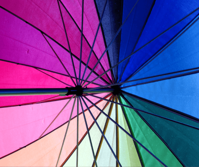
Colour Psychology
Whilst colours act as aesthetic design elements that can elevate your signage and represent your brand, it’s important to consider what these colours represent and how this could impact how customers view your business. The colours that you use can influence people's emotion and perception of your brand, which can ultimately impact whether they purchase from you or not. So, what colours should you choose and which should you stay away from?
The impact of these colours should be considered in your signage design when picking which colour should feature most prominently perhaps as the background of your sign.
Red
The colour Red is undeniably bold and attention-grabbing. It holds a unique power to evoke emotions such as passion and power, making it an excellent choice for businesses aiming to project a powerful and captivating image. Interestingly, Red has also been discovered to stimulate hunger, making it an effective colour choice for restaurants and fast food establishments.

Orange
The colour orange has a remarkable ability to create a perception of affordability, making it particularly valuable for brands that prioritise affordability pricing or aim to position themselves as more budget friendly than their competitors. Additionally, Orange evokes feelings of warmth and happiness, whilst also fostering a sense of creativity among customers.
Yellow
The colour yellow has an incredible ability to uplift customers, fostering feelings of creativity, intellect, and happiness. However, it is important to note that excessive use of the colour yellow can potentially evoke anxiety and nervousness among customers. Therefore, it is advisable to use shades of yellow sparingly to strike the right balance and create a positive and welcoming atmosphere.
Green
The colour green is widely recognised as a symbol of nature and freshness. It holds a special appeal for brands that prioritise health and wellbeing, whether it’s for individuals or the environment, as green effectively conveys this commitment. Furthermore, green represents balance and growth, adding an element of harmony and progress to brand messaging.

Purple
The colour purple has long been associated with wealth and nobility, conveying a sense of opulence and prestige. Its mysterious and tranquil nature adds an air of intrigue, making it a captivating choice for brands seeking to stand out. However, it is important to use purple effectively, as it can be perceived as immature or childish if not applied thoughtfully. By employing purple in a deliberate and sophisticated manner, brands can harness its allure while maintaining a sense of maturity and sophistication.
Pink
The colour pink is often associated with imagination, especially given its recent resurgence in bright hues. It has the power to spark feelings of passion and creativity among customers. However, it is important to wield pink with care, as incorrect usage may come across as excessive and off-putting to some consumers. By using pink thoughtfully and in moderation, businesses can tap into its imaginative qualities while maintaining a balanced and appealing aesthetic.
Blue
The colour blue is renowned for its ability to evoke feelings of trust, serenity and peace. Its calming properties make it especially valuable for reducing tension and fear among customers, which is why it is often used in environments dedicated to relaxation, such as spas. By incorporating the colour blue, businesses can create a soothing and inviting atmosphere that promotes a sense of tranquillity and comfort.

Black
The colour Black exudes an undeniable air of sophistication and security, making it a popular choice among high-end brands to convey the message that customers’ investments will be worthwhile. However, it’s important to note that black runs the risk of appearing cold and can be associated with mourning due to its traditional connotations. By using black strategically and complementing it with warm or contrasting elements, businesses can maintain an air of elegance while avoiding any unintended negative associations.
White
The colour white is frequently employed to symbolise innocence, purity, cleanliness and simplicity. It carries with it an inherent sense of freshness and clarity. However, it's important to be mindful that excessive use of white can give off a sterile, empty, and plain impression. Interestingly these characteristics can be effectively utilised within certain business models to create a minimalist and sleek aesthetic. By striking the right balance and incorporating white intentionally, businesses can harness its associations of purity and simplicity while avoiding an overly stark or uninspiring atmosphere.

Looking into the colours that you choose for your signage can help you create the atmosphere that you want and attract the right kind of people to your business. Understanding how colours can influence your client base and using them to ensure your brand message is being portrayed is an easy way to create a strong brand presence. Let us help you make a lasting impression with your signage. For more information on how signage can work for you contact the experts at FASTSIGNS Northampton on 01604 422650 or request a quote.