The PANTONE® Colour of the Year is so much more than a swatch. It inspires trends from interior design to sneakers, influences branding in every industry and captures the emotional tone of the year for posterity. Pantone’s colour chart provides colour codes to ensure accurate and consistent communication for designers across the globe. The Pantone Colour Institute conducts research on how colour influences human thought processes, emotions and physical reactions to help professionals utilise it more effectively. This Institute has selected a colour each year since 2000 that best represents the design trends and global zeitgeist of the times.
The 2020 Pantone Colour of the Year helps sets the stage for an all-new era as we approach the next decade in our history. Described as a timeless and enduring hue that is elegant in its simplicity, the 2020 Pantone Colour of the Year is PANTONE 19-4052 Classic Blue. Stepping into the New Year, this comforting yet captivating shade represents a common desire for stability while encouraging resilience.
2020 - Pantone 19-4052 Classic Blue
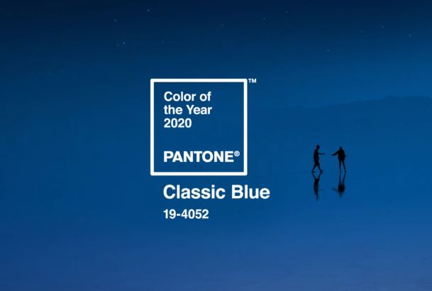
“We are living in a time that requires trust and faith. It is this kind of constancy and confidence that is expressed by PANTONE 19-4052 Classic Blue, a solid and dependable blue hue we can always rely on,” said Executive Director of the Pantone Institute, Leatrice Eiseman. “Imbued with a deep resonance, Classic Blue encourages us to look beyond the obvious to expand our thinking; challenging us to think more deeply, increase our perspective and open the flow of communication.”
As we close the door on the 2010s, let’s take a look back over the past 10 years as defined by their Pantone colours…
2019 – Pantone 16-1546 Living Coral
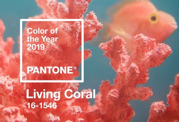
Named vibrant, yet mellow, Pantone's 2019 colour of the year is known for its striking and bold presence throughout the world's natural surroundings as well as our Instagram feeds. Living Coral emanates a sense of lightheartedness and optimism which is something everyone is looking forward to in the new year.
“Colour is an equalizing lens through which we experience our natural and digital realities and this is particularly true for Living Coral,” said Eiseman."With consumers craving human interaction and social connection, the humanising and heartening qualities displayed by this colour hit a responsive chord."
2018 – Pantone 18-3838 Ultra Violet
.jpeg)
In 2018 Pantone chose a colour that was heavily based on our love of exploration that also pays homage to lost legends. Ultra Violet is a dramatic and mysterious purple shade meant to evoke the vast night sky. Inspired by the new space race, this colour also looks back on the people who made purple what it is – icons like Prince, David Bowie, and Jimi Hendrix.
“We are living in a time that requires inventiveness and imagination” commented Eiseman. “It is this kind of creative inspiration that is indigenous to PANTONE 18-3838 Ultra Violet, a blue-based purple that takes our awareness and potential to a higher level. From exploring new technologies and the greater galaxy, to artistic expression and spiritual reflection intuitive Ultra Violet lights the way to what is yet to come.”
2017 – Pantone 15-0343 Greenery
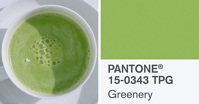
2017 brought us a bright inspiring yellow-green as the colour of the year. A colour meant to remind us all of a fresh spring day, where you wake up to the birds chirping and step outside to breathe in the fresh clean air. This colour was inspired by the return to nature. Pantone stated “The more submerged people are in modern life, the greater their innate craving to immerse themselves in the physical beauty and inherent unity of the natural world. This shift is reflected by the proliferation of all things expressive of Greenery in daily lives through urban planning, architecture, lifestyle and design choices globally.”
Eiseman explained, “Greenery bursts forth in 2017 to provide us with the reassurance we yearn for amid a tumultuous social and political environment. Satisfying our growing desire to rejuvenate and revitalize, Greenery symbolizes the reconnection we seek with nature, one another and a larger purpose.”
2016 – Pantone 13-1520 + Pantone 15-3919 Rose Quartz and Serenity
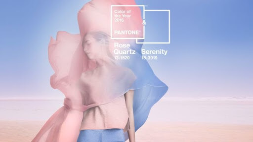
For the first time in their history, Pantone decided to choose two colours for the 2016 Colour of the Year. Based on what they saw culturally and socially within the changing gender movement, Pantone chose two colours that can be blended together and change. They sought to challenge the traditional views of colour association.
On the two-colour choice, Eiseman said, “Joined together, Rose Quartz and Serenity demonstrate an inherent balance between a warmer embracing rose tone and tranquil blue, reflecting connection and wellness as well as a soothing sense of order and peace.”
2015 – Pantone 18-1438 Marsala
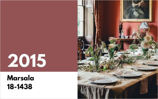
Inspired by the strong fortified wine bearing the same namesake, Marsala was the colour chosen for 2015. A deep earthy reddish-brown made for an amazing accent colour for the home, clothing and accessories, Pantone described Marsalas as a colour that enriches our minds, bodies and souls. “Marsala is a subtly seductive shade, one that draws us into its embracing warmth,” said Eiseman. “It’s a colour that is universally appealing and translates easily to fashion, beauty, industrial design, home furnishings and interiors.”
2014 – Pantone 18-3224 Radiant Orchid
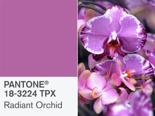
The Pantone Colour of the Year for 2014, Radiant Orchid, is a bright combination of fuchsia, purple and pink. Encouraging originality and creativity, it made sense for a year that saw amazing technology breakthroughs and the continued rise of small business success in America. Eiseman explained the choice for the Pantone Colour of 2014, “Radiant Orchid inspires confidence and emanates great joy, love and health. It is a captivating purple, one that draws you in with its beguiling charm.”
2013 – Pantone 17-5641 Emerald Green
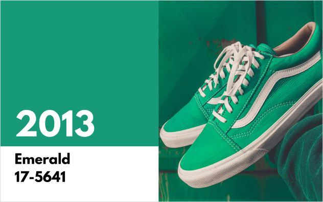
Vivid and verdant, Emerald reflected the renewal and growth the nation was relieved to experience in 2013. Emerald represents prosperity, sophistication and luxury in many cultures making it a stylish choice for high-end fashion and home goods.
Eiseman said in the press release, “As it has throughout history, multifaceted Emerald continues to sparkle and fascinate. Symbolically, Emerald brings a sense of clarity, renewal and rejuvenation, which is so important in today’s complex world.
2012 – Pantone 17-1463 Tangerine Tango
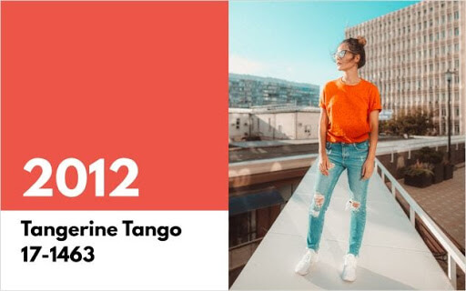
Tangerine Tango is an optimistic reddish-orange. This colour was featured prominently by fashion designers in 2012 with Tommy Hilfiger, Nanette Lepore, Elie Tahari and Adrienne Vittadini showcasing it in their spring collections.
The release announcing its selection described Tangerine Tango as the energy boost we needed in order to recharge and move forward.
2011 – Pantone 18-2120 Honeysuckle
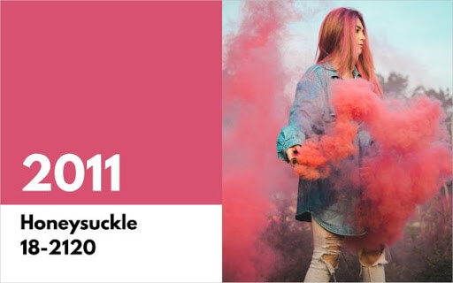
In 2011 Pantone selected Honeysuckle, a dynamic reddish pink. Pantone also released a popular line of bridesmaid dresses with The Dessy Group in 200 colours and the Honeysuckle dress was everywhere at 2011 weddings
“Honeysuckle emboldens us to face everyday troubles with verve and vigour…Honeysuckle is encouraging and uplifting,” the release explained. “It elevates our psyche beyond escape, instilling the confidence, courage and spirit to meet the exhaustive challenges that have become part of everyday life.”
2010 - Pantone 15-5519 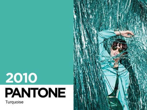
In 2010 the financial crisis was still affecting many Americans and Pantone decided we could all use a little escape.
“Turquoise is believed to be a protective talisman, a colour of deep compassion and healing, and a colour of faith and truth, inspired by water and sky,” said Eiseman. “Through years of colour word-association studies, we also find that Turquoise represents an escape to many – taking them to a tropical paradise that is pleasant and inviting, even if only a fantasy.”
Do you remember these colour trends throughout the years? You may recall them better than other events. Research shows that our memory works better with colour than black and white. Definitely something to consider in future store décor and brand design.