The subject of colour contrasts within signage recently came to mind when I was driving behind a van whose sign writing was illegible. I was straining to read the text because they had used navy vinyl lettering on a dark grey van.

When I reached a set of traffic lights and was able to read the text I realised it was a well-known van rental company whose branding was usually a combination of blue text on a white background.

I then envisioned a scenario where the fleet manager was delighted to get a new batch of vans at a much better price by buying them in dark grey; not considering the impact this would have on the legibility of their branding. I then imagined a Marketing Manager looking on in horror as one of the vans drove past them in the street and the realisation of this oversight in colour contrast hit home.
Sending a clear message
Making good colour choices in your signage is essential to the legibility of your text and branding. The better the contrast, the clearer your message will be.
Distance and point of view of your audience can also be a deciding factor when considering colour contrast. If you’re on a narrow street, contrast won’t be as important because people will easily see the sign’s message. However, if you want to catch the attention of people across a car park, or passing at speed on a road, then signs that stand out with a defined colour contrast are essential.
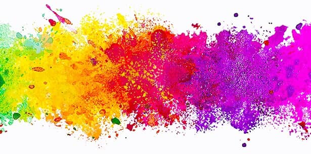
You can see some examples of good and bad colour contrasts below.
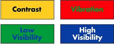
Black on yellow and white on blue create well defined, high quality contrasts. The text is clear and crisp. The words are clear on the background and would be clearly visible from a distance.
The green text on the red background and blue text on the green background are both examples of a poor contrast. The text is lost on the background and the edges of the lettering appear blurred and undefined. We all know that “red and green should never be seen” and this example of green on red gives me a headache. - I feel for the people of Portugal who have to watch their national football team play with this colour contrast on their kits!
Safety colours as a universal language
Choosing contrasting colours is especially important when designing safety signage. It is universally accepted that colour contrasts such as white text on a red background indicate danger; the sign’s purpose is to guide or warn us in some way, before we have even read the text. This also means that if we see signage in a language we do not understand we still know to take care and possibly seek more information.
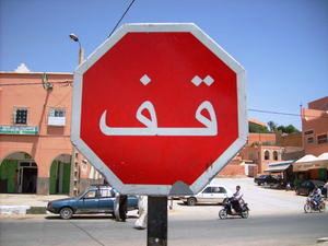
The colours chosen from safety signs help them stand out from their surroundings. They draw the eye to them and are meant to get your attention.
Consider the environment
When choosing colour contrasts for your signage you also need to consider how your colours will appear in their surroundings. Metal and glass can appear as different colours depending on what is reflected in them, the weather, and the lighting in the space.
Even on this small example below we can see the different shades that the metal can take on under uneven lighting. Colours can go from having a vivid contrast to being lost when viewed from different angles.

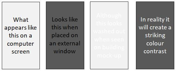
Metals with a mirrored finish will reflect the area around them, changing the appearance throughout the day/year. Although a certain colour contrast may look good on a computer screen during design, the area surrounding the sign can have a big impact on the colour.

This effect can also happen when applying branding to windows. When creating signage for glass, designers will often start with a white or grey background because glass is clear. Right?
In reality, glass usually appears as a dark surface, especially if it’s on a street with tall buildings around it. With this in mind, white, or other light colours, give the best contrast against the dark colour of the glass.
All this said, there are exceptions to every rule and you shouldn’t let these ‘rules’ hold you back from incorporating your branding into your environment. With the variety of signage solutions, colours and materials available, there will always be a way to create a contrast which makes your branding stand out. If in doubt, we can bring colours samples to site to test them in the proposed sign location.
If you’d like any advice on the use of colour in your signage, please get in touch and I’ll be happy to offer any help I can.