Why does environmental calm matter in business spaces?
Stress and anxiety increasingly affect both your workers and your customers. Workplace stress costs British businesses billions each year in lost productivity and sick days. Creating calming environments by using considerate signage represents a low-cost, high-impact approach to improving employee wellbeing and customer satisfaction simultaneously.
Having worked with many corporate clients, we at FASTSIGNS Manchester have seen how cluttered, confusing and aggressive visual communication styles can sharply increase stress levels. So here is our guide on how clear, harmonious and thoughtfully designed signage can be used instead to reduce anxiety and improve focus.
How does signage contribute to environmental stress?
Before exploring calming solutions, it's worth understanding better how signage creates or reduces stress. Visual clutter from excessive signage, conflicting messages or poor organisation overwhelms us and increases our cognitive load. Information overload from overly complex signs requiring excessive reading or decision-making creates anxiety, particularly for visitors unfamiliar with your environment.
Colour psychology strongly affects emotional responses. Harsh reds and oranges can increase agitation, whilst too much black creates an oppressive atmosphere. Inconsistent visual language across signage forces constant mental recalibration as viewers encounter different styles, fonts and organisational approaches throughout your space.
So what colours create the most calming environments?
Colour selection is one of the most powerful tools in creating calming signage. Research into colour psychology consistently demonstrates measurable emotional and physiological responses to different colours.
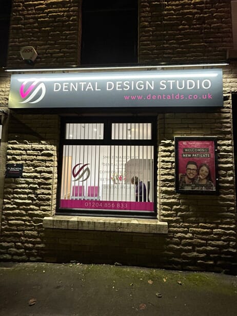
Blue promotes calm, trust and focus. It's the most universally calming colour across cultures, reducing blood pressure and heart rate whilst improving concentration. Healthcare settings, professional services, and any environment where anxiety is common, benefit from blue-dominant signage palettes.
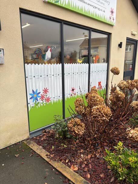
Green evokes nature, growth and balance. It's particularly effective in urban environments where access to nature is limited because it feels so restorative. Shades of green work well for wellness businesses, environmental companies or any organisation wanting to communicate sustainability alongside calm.
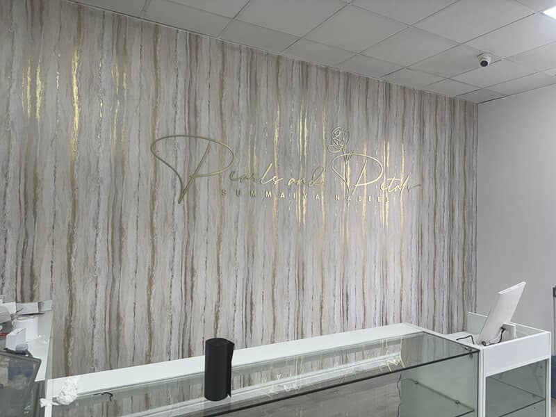
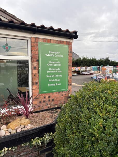
Soft neutrals including beige, grey and off-white don’t have to evoke your nan’s ‘70s magnolia! They can contribute to peaceful backdrops that don't aggressively demand attention. These shades work particularly well for wayfinding and functional signage that needs to be clear without dominating the environment.
Warm earth tones convey stability, comfort and natural connection. Browns, terracotta and warm greys create grounding effects particularly valuable in stressful environments. These colours work effectively in hospitality, retail or service environments where customer comfort directly affects satisfaction - and spending.
How does typography affect feelings of calmness?
Font selection influences emotional response just as powerfully as colour choice. It communicates personality and tone before readers even process the actual words.
Sans-serif fonts generally feel more approachable and less formal than serif alternatives. Clean, simple fonts reduce mental processing by being easy to read quickly. Rounded fonts feel friendlier and less threatening than angular alternatives.
Letter spacing and line height significantly affect readability and calmness. Cramped typography creates visual tension whilst generous spacing allows the eye to rest. Text that readers can process effortlessly creates calmer experiences than text requiring concentration and effort.
Font size accessibility reduces frustration and anxiety. Signage that's too small creates squinting, confusion, and stress - particularly for older visitors or those with visual impairments. Properly sized fonts that all visitors can read comfortably eliminate this source of environmental stress.
Can information design reduce stress?
How information is organised and presented dramatically affects stress levels. Clear hierarchy helps visitors quickly identify the information they need without reading everything. Well-designed signs use size, weight, colour and positioning to guide eyes naturally through information in order of importance.
Similarly, plain language improves comprehension across all education levels, not just those with literacy challenges. Progressive disclosure provides information in digestible chunks rather than overwhelming viewers with everything simultaneously. Digital signage is particularly good in this respect, displaying essential information prominently whilst making detailed information available through touch or QR codes for those who want it.
Consistent information architecture across all signage also makes processing easier. When every sign in your environment follows the same organisational logic – such as always placing location names at the top, directional arrows in the middle and distance at the bottom - visitors quickly learn the pattern and scan signage more easily.
How do choice of materials, finish and lighting affect emotional responses?
Soft, matte finishes feel calmer than glossy, reflective surfaces. Gloss creates visual noise through reflections and glare whilst matte surfaces absorb light gently. In fact, illumination quality dramatically affects how signage contributes to environmental calm or stress.
Harsh, bright lighting creates glare, increases eye strain, and elevates stress hormones. Soft, warm lighting promotes relaxation and comfort whilst still providing adequate visibility. LED technology now allows precise colour temperature control, enabling warm white (2700-3000K) for calming environments rather than cool white (4000K+) that feels more clinical.
Backlit signage with diffused illumination creates gentle visibility without harsh spotlighting. Edge-lit signs provide sophisticated look whilst directing light controllably. Signage should be adequately lit for visibility without becoming spotlit attractions that disrupt environmental calm.
Tactile signage engages additional sense satisfaction, creating richer experiences that can ground anxious visitors. Textured materials, dimensional letters or Braille add physical interest whilst serving accessibility functions. Or how about placing your wayfaring signage on a wall of plants for added calm? Similarly, rounded edges and organic shapes feel less threatening than sharp angles and rigid geometric forms.

How can digital signage be calming?
Digital displays often get dismissed as inherently stressful, but thoughtfully implemented digital signage can be more calming than poor static alternatives. Movement speed and transition styles significantly affect stress response. Gentle fades feel calmer than sudden cuts or fast animations. Slower content rotation allows adequate viewing time without pressure.
Content density on digital displays should be carefully controlled. Screens crammed with information create the same cognitive overload as cluttered static signs. Simple, focused messages displayed generously on-screen feel calmer and more professional than dense information displays.
The businesses achieving greatest success with calming signage recognise that the visual environment profoundly affects human wellbeing. By investing in thoughtful signage that reduces rather than increases environmental stress, they create spaces where both workers and customers feel more comfortable, focused, and positive.
FASTSIGNS® Manchester will help you find the signage solutions that translate these outcomes into improved business performance.
Give us a shout!
(OK, maybe don’t shout…)