Why does brand-aligned signage matter?
Your signage does more than just offer directional information or promotional messaging. It's a physical manifestation of your brand identity.
Consistent brand presentation across all platforms is essential to your bottom line. And this includes signage as one of your most visible brand touchpoints. For businesses across the North West, local competition is fierce and customer loyalty is hard-won, but easily lost. Signage that accurately reflects your brand identity creates recognition, builds trust and ensures you stand out from your competitors.
The challenge lies in translating often abstract brand values, such as professionalism, innovation, sustainability or heritage, into concrete visual communications that customers encounter all the time.
What are your core brand elements?
Before incorporating your brand into your signage, it’s a good idea to clearly define your identity. This goes beyond logos and colours to encompass brand personality, values, positioning and the emotions you want your customers to experience. Successful brand integration starts by asking: If our brand were a person, how would they communicate?
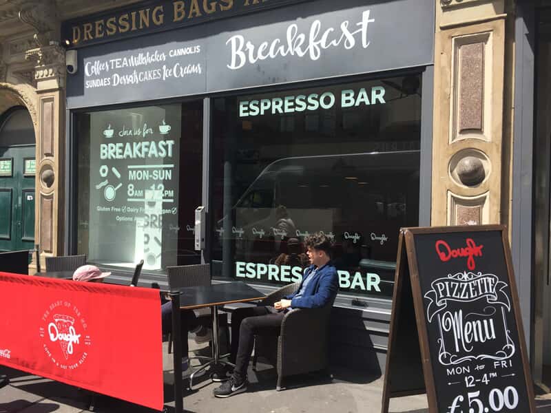
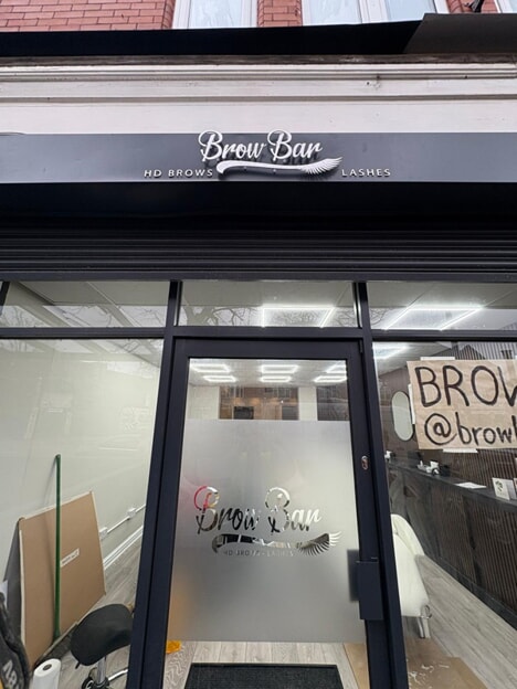
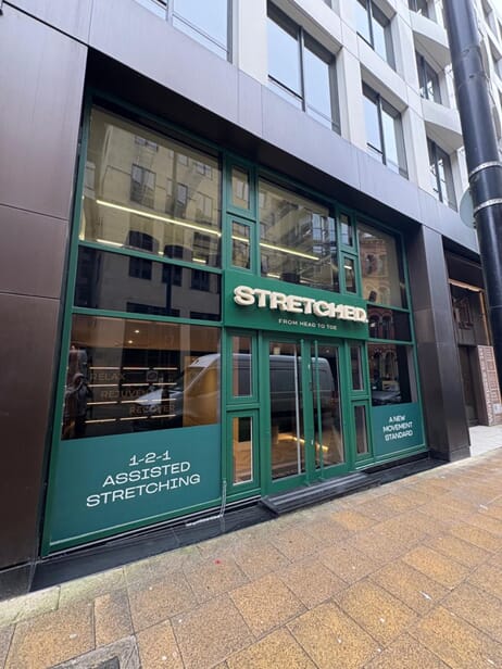
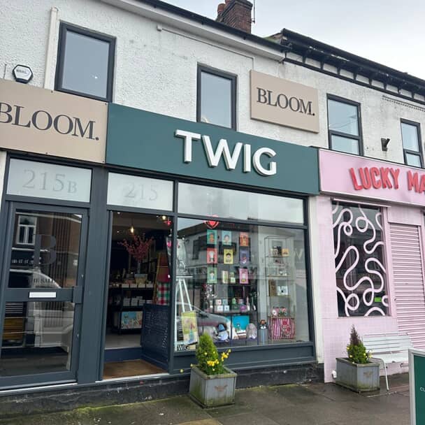
Your visual identity guidelines are crucial here. These include elements such as your logo design and usage, colour palette with specific specifications, typography hierarchy and font selections, imagery style and photography approaches, and graphic elements or patterns unique to your brand. Using your established brand palette consistently across all signage, from external building signs to internal wayfinding, will create a cohesive professional identity that reinforces your value to your customers.
Brand voice and tone also influence signage language. A playful, informal brand should use different wording from a more traditional, formal one, even when communicating identical information. Your signage language should always match how your brand speaks across all your channels.
How do you translate your brand into physical signage?
Converting abstract brand attributes into tangible signage requires systematic thinking about how every element communicates brand identity.
Your established brand colours should dominate your signage palette, but understanding a little about colour psychology will help you to deploy them effectively.
Blue signals trust and professionalism – which is ideal for financial services or healthcare.
Green communicates growth and sustainability – which is perfect for environmental businesses or wellness brands.
Red creates urgency and excitement – which is effective for hospitality or retail.
But it doesn’t stop with colour: incorporating, say, natural wood materials into a green colour palette will reinforce their sustainability as a primary brand value.
Font choices also make an important contribution. Serif fonts suggest tradition, reliability, and established credentials - appropriate for professional services, heritage brands, or premium products. Sans-serif fonts feel modern, clean, and approachable – better suited to technology companies, contemporary retailers or service businesses.
Script fonts convey elegance, creativity, or personal touch, and are often favoured by boutique businesses, artisan producers or hospitality. But font consistency across all signage is non-negotiable: it reinforces brand recognition whilst font hierarchy, such as letter size, guides customers through information logically.
Materials selection extends brand identity into tactile experience. Premium brands often invest in high-quality materials such of brushed metal, quality wood or substantial acrylic. These materials communicate value through physical presence. Eco-conscious brands prioritise sustainable materials that demonstrate environmental commitment. Modern tech brands might favour sleek digital displays, whilst heritage brands could embrace traditional materials but with contemporary treatments.
Can you maintain brand consistency across different signage types?
The challenge of brand integration intensifies when balancing consistency across wildly different spaces: think how you might ensure consistency from large external building signs to small internal labels, but whilst also making sure that each serves its functional purpose properly.
We suggest you create a signage style guide that sits alongside your broader brand guidelines. This should lay out how brand elements adapt to different signage contexts whilst maintaining brand recognition. Include examples showing logo sizing at different scales, colour usage for various signage types, typography hierarchy for different information levels, acceptable material choices for indoor versus outdoor applications, and guidance on maintaining brand personality across functional versus promotional signage.
Wayfinding signage is a particular challenge for brand consistency. These functional signs must prioritise clarity and legibility, yet they still contribute to an overall positive brand impression.
How do local businesses reflect location in brand signage?
Brand identity often includes local connection as a key differentiator against national chains. Incorporating location into brand signage without appearing generic requires careful thought.
Architectural integration demonstrates respect for local character. Traditional hanging sign brackets and proportions nod to heritage whilst clean typography and bold colours communicate contemporary credentials. Highlighting local materials or manufacture can really strengthen community connection.
What mistakes should you look out for?
Several common missteps weaken the connection between brand identity and signage, diluting impact and confusing customers.
Inconsistent execution is the most frequent failure. When external signage uses colours, fonts or styles that differ from internal signs, or when individual departments create signage independently, the resulting visual chaos can be lethal for brand recognition.
Over-reliance on logos without broader brand integration leads to missed opportunities. Simply applying your logo to generic signage doesn't create brand-aligned communications. Successful integration requires thinking about how every signage element, from materials to colours, language and imagery, reinforces brand identity beyond just the logo.
Also ignoring functional requirements for brand aesthetics damages both wayfinding effectiveness and brand perception. Signage must work practically before it can work aesthetically. Beautiful signage that customers can't read or understand creates frustration that damages brand perception more than utilitarian but effective signage ever would.
What about the ROI on investment in brand-aligned signage?
Measuring ROI requires looking beyond direct sales to how brand identity is being consistently reinforced across all areas of your business. For instance, customer trust increases when brand promises are supported by your actual offering, whilst premium pricing needs to be supported by premium branding and quality signage that demonstrate superior value.
But the really crucial factor is this. Businesses achieving the greatest success with brand-aligned signage view it as long-term brand-building infrastructure rather than a short-term expense.
By ensuring every sign reinforces brand identity, they create recognition and trust that compound over time into a sustainable competitive advantage. FASTSIGNS® Manchester will help you design and install signage that truly reflects your brand identity and drives your business forward. Let’s talk.