Why Does Child-Friendly Signage Matter for Your Business?
Creating a welcoming environment for families is a non-negotiable any modern business. Whatever your sector, be it healthcare provision, retail or leisure and hospitality, families represent a large slice of your customers’ spending power.
However, achieving a truly inclusive space requires more than just goodwill. It demands a sophisticated approach to signage that recognises children as active, independent participants in your commercial environment.
When a space is thoughtfully designed with children’s needs in mind, it provides immediate reassurance to parents that your business is both safe and sensitive to their needs. This guide explores how expert signage solutions can transform your premises into a high-performing, family-friendly destination.
The Sightline Shift: Implementing Dual-Height Wayfinding
The most significant barrier to effective communication in commercial spaces is often just a matter of physical scale. Research into school safety consistently shows that children process visual information differently from adults. Traditional wayfinding systems are almost exclusively designed for the adult sightline. This typically leaves children feeling disorientated and often heavily dependent on parental instruction. This dependency creates friction, as parents must stop and pass on every instruction, disrupting the flow of their journey around your business.
To resolve this, we recommend a dual-height signage strategy.
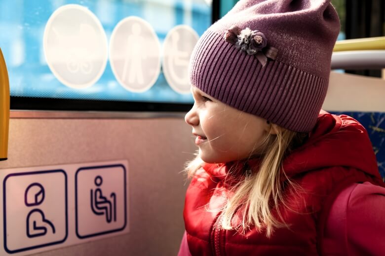
Adult Eye Level (1.4–1.7 metres): This remains the primary location for information such as regulatory notices, detailed directional text and pricing.
Child Eye Level (0.9–1.2 metres): Essential wayfinding and engagement elements should be positioned here to cater to children from approximately age three upwards.
By adopting this approach, you allow families to navigate your premises independently. For example, museums often utilise this level of placement so that children can follow activity instructions whilst their parents read exhibition details at a higher level. Furthermore, incorporating floor-level graphics, such as the footprint trails often used in soft play centres, guides children naturally without adding visual clutter to your walls.
The Psychology of Colour and Cognitive Load
While it is tempting to use bright, saturated colours to attract young visitors, a professional B2B environment must balance engagement with the risk of overstimulation. Excessive colour saturation can create "visual chaos" that actually hinders a child's ability to take in a sign’s message.
Strategic colour-coding is far more effective. In nurseries, for instance, distinct colours are often assigned to different age groups, allowing even children younger than reading age to recognise "their" space through association. To maintain clarity, each sign should be limited to a maximum of two or three colours.
In professional or educational settings where focus is paramount, softer tones are often to be preferred. Pastel blues, soft greens and warm neutrals create a calm atmosphere conducive to concentration and reduced noise levels that lead to tangible improvements in classroom focus at the primary school level.
The Language of Welcome: Positive Framing
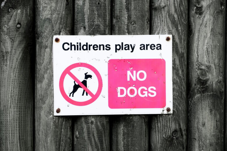
Traditional prohibition signage characterised by "DO NOT…" and "NO RUNNING" commands reflect an anxiety-inducing, heavy-handed approach that can paradoxically create an atmosphere that increases the very behaviours a business seeks to manage. A more sophisticated, marketing-led approach is to frame rules positively.
Replacing "NO RUNNING" with "Please walk" or "DON'T TOUCH" with "Please look with your eyes" can often achieve better behavioural outcomes whilst upholding the warm brand voice you want to maintain.
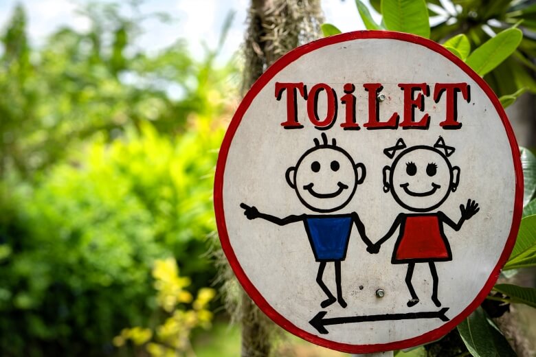
For younger children and those with literacy challenges, visual pictograms are essential. These should demonstrate the desired action rather than the prohibited one. For example, showing a child walking carefully is processed more quickly by a young brain than an image of a child running with a red line through it. And adding a touch of gentle Northern humour, such as "Our floor prefers feet that walk", can communicate boundaries with engaging warmth leading to the desired outcome.
Engineering for Interaction and Safety
Safety is the cornerstone of any family-friendly business. Because children interact with signage physically, meaning they bump into everything and explore it through their hands, the material specifications must be more rigorous than standard office signage designed for adults.
Physical Integrity: Rounded corners are non-negotiable to eliminate sharp edges. All free-standing units must have stable, topple-proof bases to prevent injury if a child attempts to climb them.
Non-Toxic Durability: As children touch everything, signage materials must be non-toxic and capable of withstanding regular, intensive cleaning without degrading.
Emergency Provisions: In an emergency, smoke can obscure high-level exit signs. Forward-thinking schools and businesses now use low-level emergency lighting and exit indicators specifically positioned for a child’s sightline to ensure safe evacuation should the worse happen.
Balancing Playfulness with Professional Credibility
A common concern for business owners is that child-friendly signage might appear, well, "childish," and undermine the professional image they wish to project to adults. The solution is not to avoid child-friendly elements, but to invest in sophisticated design and quality materials.
Professional execution allows for playful content without compromising credibility. For instance, high-quality, professionally designed animal illustrations can be the perfect solution for guiding children around your space. This can be particularly effective in healthcare settings. Parents often note that this kind of investment in quality materials reassures them about the overall standards of care at the practice.
A graduated design approach that is bolder and simpler for toddlers but more contemporary and subdued for teenagers can allow your business to demonstrate that it understands and respects the developing sophistication of all its visitors rather than treating all under-18s as a homogeneous mass.
Strategic Design as a Business Driver
Effective child-friendly signage serves multiple objectives simultaneously: it engages the child, reassures the parent, supports learning and ensures the highest safety standards are maintained. These are not competing goals but complementary facets of a well-managed brand.
By moving away from amateur, "clipart" aesthetics and embracing a strategic, evidence-based approach, you position your business as a dependable, inclusive, and professional solutions provider.
If this sounds like something your business needs to do, give us a call at FASTSIGNS MANCHESTER. Experience shows us how investing in professional signage is an investment in the long-term loyalty of the families you serve.