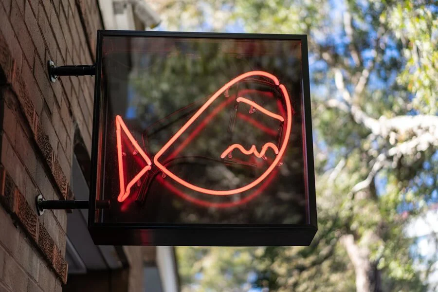
In the world of commercial signage, safety and predictability are usually the default choices. Most business owners opt for clean, understated branding designed to blend harmoniously into the high street. Yet every so often, a business’s frontage stops passers-by in their tracks with something genuinely jarring, eccentric or just plain unconventional.
Leaning into calculated provocation can be an exceptionally effective strategy for the right business, but it demands a level of design discipline that many underestimate.
Done well, it captures immediate attention and builds a loyal audience. But done poorly, it becomes a costly lesson in why bad taste is usually best avoided.
So this is FASTSIGNS Manchester’s handy guide to how to be provocative without your business looking cheap and tasteless (we find it’s better to keep that in our private lives…)
The Distinction Between Disruptive and Tacky
There is a vast difference between being thoughtfully disruptive and simply being messy.
True provocative design challenges visual conventions or sparks curiosity by employing sharp, self-aware humour. It is an approach you’ll often see favoured by independent bars, boutique fashion outlets and contemporary creative agencies that want to signal immediately that they are rejecting the corporate norms.
In dense urban settings, where there are dozens of brands competing for the same few seconds of your attention, playing it safe can mean a business becomes pretty much invisible.
Unconventional signage works when it matches and says something about what actually happens inside the premises. If a contemporary venue uses stark typography, industrial materials or unexpected imagery, its target audience is likely to read that as expressing confidence and originality. But apply the same treatment to a business whose offer is conventional and the mismatch jars. And customers will notice.
The goal of calculated provocation should be intentional and carefully executed visual friction that invites engagement rather than alienates your core market.
Where Unconventional Signage Fails
The primary risk is that provocative design slides into looking cheap, unprofessional, aggressive even. This almost always happens when a sign relies too heavily on shock value and neglects having a solid design foundation underneath. Poor-quality imagery, chaotic layouts or flimsy materials do not read as edgy as you intended. They read as amateurish.
Crucially, provocation must never come at the expense of legibility. People take in signage in a matter of seconds, say whilst walking or driving. If an avant-garde sign is so abstract that one of your prospective customers cannot work out what your business actually does, or where your front door is, it has failed its basic commercial purpose. Intentionally complex typography or unusual colour pairings are counterproductive if they cannot be read from the pavement within about three seconds.

There is also the question of staying power. Shock and humour lose their charge with repetition: remember your regular customers will be walking past your signage every day. A concept that works the first time it’s seen can become downright annoying by the hundredth time. The strongest provocative schemes pair a bold idea with enough craft and restraint to keep feeling intentional over time.
And let’s face it: Manchester is a pretty low-tolerance zone for the pretentious and self-regarding. There’s no better way to alienate the local customer base than trying too hard and going over the top trying to look different when you’ve got nothing to back that up.
The Craft Behind High-Contrast Rule-Breaking
To create provocative design successfully, designers rely on specific visual principles rather than random rule-breaking.
Controlled colour clashes are one example of this. Setting neon acrylic accents against raw, unvarnished industrial steel breaks with traditional brand palettes and pulls the eye away from neighbouring shop fronts. What’s crucial here though is that the restraint of the surrounding materials is what’s keeping the effect looking deliberate and professional.
Typographic scale is another powerful tool. Oversizing a single character or phrase, while keeping the secondary information tightly aligned, forces the viewer to slow down and read the message more consciously. The contrast between the dominant element and the disciplined supporting text ensures the signage looks designed rather than random and chaotic.
Juxtaposition of materials completes the core toolkit. What do we mean by this? Pairing raw, textured substrates such as weathered Corten steel or reclaimed timber with crisp, modern LED illumination creates an immediate tactile contrast. Each material has a specific job to do so that the tension between them gives the sign its character.
Test the Idea Before You Commit
Because bold signage is always going to be a bigger gamble than conventional signage, your brainwave deserves more testing, not less.
You should be asking us for scaled visualisations or full-size mock-ups, and viewing them from the distances and angles at which real customers will see them, in daylight and after dark, before you commit to anything. Show them to people who don’t know your business and ask them to say what they think your business actually does. If their answers are wide of the mark, the concept is clearly not going to work for you yet.
It is also sensible to check the regulatory position early. Advertisement controls in England cover matters such as illumination, meaning premises in conservation areas or housed in listed buildings can face additional restrictions. So it’s sensible to discuss an ambitious concept with your local planning authority before you press the button on printing.

Striking the Right Commercial Balance
Anything innovative is always risky, a bit trial and error. Executing an unconventional signage strategy demands particular technical expertise and the time (and budget) to stick with it until you hit on the right version for you.
The best way to get it right without wasting time and money is to work with experienced sign makers who know how to break layout conventions without compromising structural integrity or legibility. And they don’t come any more experienced than us!
If you want to stand out on a crowded street, calculated provocation can set your business apart, provided the quality of the materials, the safety of the installation and the standard of craftsmanship match the boldness of the concept.
We’ll make sure they do.
