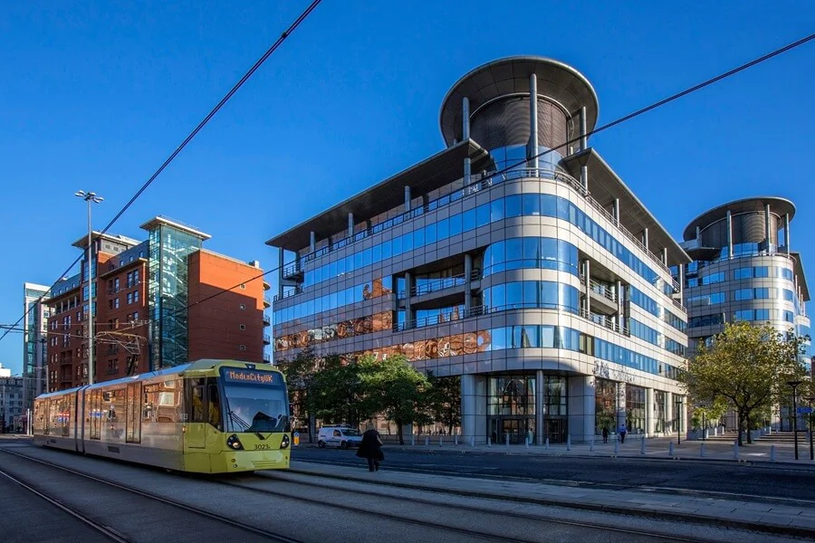
One thing anyone who’s been in and around Manchester in recent years can’t have failed to notice is the public transport makeover that’s been gradually gathering pace. The trams, the buses and, over the next few years the trains, are all becoming part of Manchester’s very own Bee Network. And what does any public transport network need? Signs. And lots of them.
So we thought, a little public service. For all you local sign connoisseurs out there, here’s our take on the network’s signage strategy to help you understand what’s really going on the next time you hop aboard the tram.
Why Public Transport Systems are Signage Heaven
Public transport networks are among the most demanding spatial design environments in existence. Every day, huge numbers of commuters, tourists and occasional travellers must navigate complex interchanges under time pressure. And not always in the best of moods…
Across Greater Manchester, the Metrolink tram network, the largest light rail operator in the UK, serves 99 stops and carries more than 44 million passenger journeys a year. But understanding the visual logic used to guide so many people through its stops and interchanges can also offer valuable lessons for any businesses wanting to improve navigation on their own (probably more modest) premises.
The Power of Universal Symbols and High Contrast
Step onto any Metrolink platform or busy transport interchange and you immediately notice a reliance on clear, standardised pictograms, high-contrast typography and consistent colour coding. In other words: yellow. Lots and lots of nice, bright, warm, happy yellow. And drawings of trams. And bees.
Public transport serves an exceptionally broad public, including young children, international visitors and people with visual or cognitive impairments, so it cannot rely exclusively on written English.

For private commercial spaces such as healthcare facilities, campuses, industrial estates or large retail developments, adopting this logic is transformative. Universally recognised pictograms for reception desks, exits, lifts and toilets bypass language barriers and reduce cognitive friction. That particularly matters in the North West, especially in central Manchester where visitors to a hospital, college or business park may speak any of a number of different first languages. Anyone entering can orient themselves without stopping to ask staff for directions. Strong contrast between lettering and background also helps visitors with sight loss, which makes your premises easier for everyone to use.
Progressive Disclosure: Information at the Moment of Decision
One of the most effective principles in transport navigation is progressive disclosure: presenting information only when someone needs it to make a decision, rather than all at once.
A traveller is not shown a detailed regional map at every platform entrance. High-level directional signage first guides them to the correct platform, signage on the platform then gives line details, and onboard displays announce the next stop.
Commercial premises benefit enormously from the same stepped approach. Approach signage, such as a totem or gate sign, establishes the site boundary and main entrances. Orientation signage in the foyer then introduces the major zones, floors or wings. Finally, directional signage in corridors guides visitors step by step to specific rooms or offices. Trying to list every room and department on a single entrance board creates immediate overload and increases confusion. But a sequence of simple decisions lets people build confidence as they move through the building with minimum fuss.
Designing for Human Movement, Sightlines and Pressure
People moving through transport hubs are often rushed, distracted or unfamiliar with their surroundings. Transport signage compensates for this by placing critical directional signs above natural sightlines, typically at heights of around 2.1 metres or more so that crowds do not obstruct them. It also uses high-contrast lettering and non-reflective matte finishes that remain legible under harsh artificial lighting.
The same thinking applies away from the platform. Visitors arriving at a busy hospital or a large industrial park are frequently anxious, late - or both. Signs that sit clear of obstructions, avoid glare and present one decision at a time reduce that pressure. They are also a great way of reducing the number of people who wander into the wrong area or interrupt your staff to ask the way, making everyone’s life that bit easier.
Consistency Is What Makes It Work
A further lesson is consistency. A passenger can move between stops and interchanges without relearning anything, because symbols, colours and layouts behave the same way everywhere. For a business, that means agreeing a single set of icons, colours and sign formats and applying it across every building, floor and car park, rather than letting each department or tenant improvise.
In Manchester now, public transport simply means yellow and black without anyone having to process this. When you’re commuting to work, on a cold, dark, wet Mancunian morning, the last thing you want to do is use what little energy you’ve summoned up and the capital your brain is going to need to get you to 5pm thinking about how a particular sign is supposed to get you from A to B. Every non-essential colour, shape, picture – and even sign – is stripped away according to the Goldilocks principle: not too much, not too little, just enough.

Life Beyond the Commute
By applying these tried and tested millions of times a year principles to your own premises, you turn a potentially confusing space into one that feels intuitive, safe and professional. One where your customers can be mulling their next purchase, signing the new contract, not struggling to physically navigate their way around the place.
Whether you manage a corporate headquarters or a busy industrial park, structured wayfinding reduces visitor stress and projects an immediate image of operational excellence. The next time you’re waiting on a tram platform in abject boredom, have a quick look at how the signage has been designed and deployed.
It may just give you a bright idea you want to talk to us about.
