You’re feeling positive about your business. The money’s flowing in nicely. And you want to build on this and upgrade your brand and physical appearance. So you wonder shouldn’t your signage be just a bit more up-market, a bit fancier now to show potential customers you’re the people they should be doing business with?
You start wondering what brand spanking new signage might actually look like and how it can articulate your evolving brand identity even better. But you soon find the temptation to include more information, more colours and more decorative elements is often hard to resist.
You naturally want your signage to tell the complete story of your business, listing every service, accreditation, and contact detail on every available surface. And it’s a perfectly understandable impulse: you’ve built something you’re proud of, that’s worth communicating, and every element feels important.
Yet from a practical design and commercial perspective, simplicity is almost always the most effective strategy.
Understanding why requires thinking about how human beings process visual information in real-world commercial environments . And facing the truth that actually hardly anyone is going to read your sign in its entirety.
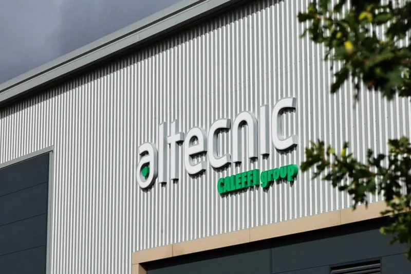
Why less really does mean more
Human beings process visual information rapidly, particularly when we’re not standing or sitting still. Whether a customer is walking down a busy high street or driving past your industrial estate at thirty miles per hour, they have only a few seconds to absorb your message before they have passed your premises entirely. It’s really only a fraction of a second that determines whether a sign registers as clear and inviting or busy and forgettable.
When a sign is crowded with too many fonts, excessive text, competing colours, and dense paragraphs of information, it creates mental overload. The brain, faced with too many competing stimuli, simply prioritises the task at hand, be that walking, driving or cycling, and disengages from the signage entirely. Instead of communicating a professional message, a cluttered sign becomes visual noise that people learn to tune out.
This is not a failure of the viewer's attention; it is a predictable consequence of overloading a communication channel that has a built-in finite capacity.
The implications of this are commercially significant. Overcrowded signage does not communicate more: it communicates less. Often a lot less. Because none of its elements achieve the visibility and impact they require to register. You end up spending money on a sign that is effectively invisible despite being physically present and ticking all your boxes.
The Commercial logic of restraint
During the brief window your signage has to register with a customer, a simple sign with a clear hierarchy will communicate its core message. A complex sign communicates almost nothing.
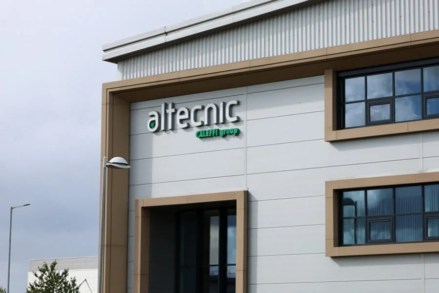
Restraint also carries an implicit quality signal. A sign that uses generous negative space, refined typography and a limited colour palette is perceived as confidently professional. In other words, the confidence of a business that trusts its name and reputation to do the work, rather than feeling the need to justify itself through sheer volume of information.
Premium brands across all sectors understand this instinctively, which is why the world's most recognised and valuable brands almost universally favour simplicity in their visual communication.
Executing simplicity with professionalism
After years of experience, we at FASTSIGNS Manchester know that achieving a simple, high-impact sign is deceptively demanding.
It requires genuine professional expertise to ensure that simplicity translates into clarity and impact rather than blandness or lack of necessary information. The temptation when designing a simple sign is to strip back everything, including the many of essential elements that make a sign commercially effective, such as name, services and clear visibility from the most common viewing distance.
Bold, clean typography forms the foundation of effective minimalist signage. We suggest using highly legible fonts, such as sans-serif for a contemporary feel or carefully weighted serif for a more traditional character. Either way, these must be selected and sized to read effortlessly from the distances where your customers will see them.
Generous negative space around your text and logo gives the eye a clear focal point without distraction. A restricted palette of two or three complementary colours maintains visual harmony and reinforces instant brand recognition.
Material quality becomes especially critical when design is minimal as the physical characteristics of your sign, think the precision of cut lettering, the quality of a powder coat finish, the evenness of backlit illumination, become far more visible. Simple signage executed in inferior materials looks cheap, whereas simple signage executed in premium materials looks genuinely impressive.
Where simplicity has limits
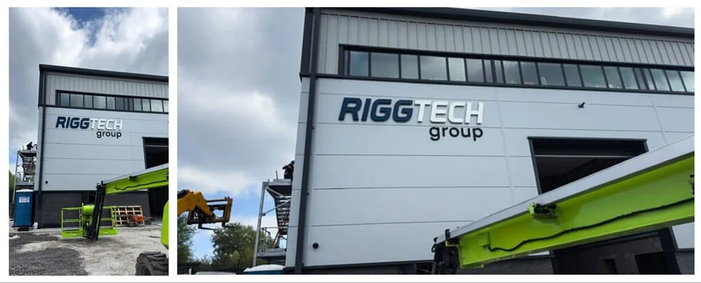
Simplicity though has a floor as well as a ceiling. A sign so minimal that it fails to communicate essential information will obviously fail to achieve its purpose. The goal is not minimalism for its own sake but the most efficient possible communication of what your business is and why customers should engage with it.
FASTSIGNS Manchester can make sure you’re investing in high-quality materials, precise illumination and expert layout to build a well-executed minimal sign that communicates supreme confidence and quality. In a competitive commercial environment, these qualities are worth considerably more than a crowded sign that nobody reads or remembers.
