“Design is intelligence made visible,” said design strategist and author Alina Wheeler.
We all know that there is great power in design from architecture to websites and clothing and yes, even signs. With so many shiny objects to distract us visually on a daily basis, how do you know if the signs you’re employing as a marketer, brand steward or small business entrepreneur, are going to achieve results?
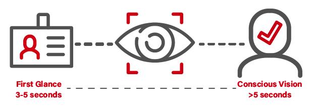
Understanding how humans visually process is the first step on your journey of understanding the factors of what makes a sign effective. You have a limited amount of time to capture the attention of your audience. According to research, you have about three to five seconds for the first impression to set in before someone’s attention is fully grabbed and they engage. Those first critical seconds have been named “first glance.”
Years of scientific research in eye-tracking studies from 3M and others from neuroscientists to cognitive scientists have revealed what elements can bring greater visibility and attention to graphics.
According to a study by the Interdisciplinary Journal of Signage and Wayfinding, the effectiveness of a sign’s message will be greatly enhanced if it can easily attract someone’s visual attention. Here are a few tools that people responsible for visualising their brand messages or creating signs have to ensure that the work will quickly grab attention and create a successful visual communication outcome:
Shape and Size
Whether your sign will be seen across a motorway or by excited shoppers walking past a retail space, the shape, size and where it’s located in the field of view all play an important role in getting prospective customers’ attention quickly.
"For greater visibility, the shape and size (the bigger the better!) of a sign must be considered. Other components such as dimensional elements and even different textures can be incorporated. Now, more than ever, people pay attention to the aesthetic of a brand. It's important to make sure the sign materials portray a brand's image and focus, so the sign perfectly portrays your brand to the customer," said Aaron Woodward, Outside Sales Professional at FASTSIGNS® Manchester. "Something I emphasise with my clients is minimising design clutter. Signs that are trying to capture attention from a distance have to be short and simple. Visibility can quickly be destroyed with too many design elements."
Fonts
According to Melinda Martin, Lead Graphic Designer at FASTSIGNS International, Inc., designing type for a project includes the consideration of visual contrast. “A bold font for a headline with a thin typeface for the body copy pairs well and is easy to read. Just like the old expression, opposites attract, a good designer chooses fonts that work so well together that the intended viewer doesn’t even notice the font and receives the message clearly.” She also shares that you need to consider the personalities of the fonts you choose when selecting pairs, so they don’t cause tension. “Less is always more when it comes to fonts, and a good rule of thumb is to not use more than two different typeface families in one project.”
Colour Contrast
Our natural eye is drawn to contrasting colours from red and green to blue and yellow. This could be a good time to reference the colour wheel to find your contrasting colours. Contrasting colours are more noticeable to our eyes because we can sense a high level or low level of colour. The RGB colour model is used for digital (think computer monitors, smartphone screens, television). It is an additive colour mode, which means you add value to increase intensity or saturation. Each primary colour of the light (in this case Red, Green and Blue) is assigned a numerical value. These can be added together in multiple ways to reproduce a spectrum of colours. This RGB level or value can show where the contrast sits numerically, and you can adjust accordingly by increasing or decreasing the numerical value of each primary colour.
“Colour contrast is essential when it comes to designing signs,” says Alan White, franchisee at FASTSIGNS® Crawley, who has been working in the design field for over 25 years. “Choosing high contrast colours will stand out and make your message a lot easier on the eyes, especially when viewing at a distance. Black lettering on a white background is the ultimate example of high contrast. When viewing from a distance, you would never use yellow or pastel-coloured text on a white background since there is little contrast between the colours.”

Intensity
If you’ve ever used an Instagram filter, then you understand this concept of how bright or contrasted images can be, even when using black and white. When thinking about an ideal sign, it needs to have enough of a punch and intensity to not look dull and washed out, as if the sign has faded in printing and importance. Colour saturation is another way to help describe the intensity. The more saturated with colour an image is, the richer or more vibrant it appears. Be wary of too much saturation as it can look unnatural and not enough saturation becomes a grey and dull image. Find a balance of colour saturation for a successful sign design.
Faces
Let’s face it (pun intended), people love to see other people (and pets!). We are biologically predisposed for looking at faces and eyes. Faces are an impactful visual element when used prominently. Take a look at recent billboards, and you’ll often see a headshot of a person that draws you in - from a baby to a smiling elderly person. If faces didn’t sell things, then we wouldn’t see them on ads.

How Can I Make Sure My Visuals and Designs Are Effective?
In an effort to create an effective visual communication plan, it’s important to look to experts as a resource who can apply both the science of visibility and creativity of design to bring about the ideal outcome. So, when your boss gives you the assignment of completely revamping the graphics and visuals, you can confidently look them in the eye and say, “I’m on it.”