
Up to 90% of purchasing decisions are based on colour alone.
Up to 90% of product selections are based strictly on colour. Have you ever stopped to think about everything that plays a part in your decision-making process?
According to a Management Decision study, within 90 seconds of a product’s first impression, people make their choice. Colour single-handedly contributes up to 90 per cent of the information that forms the decision.
As we learn our 2026 Colour of the Year by Pantone, the importance of colour rises in our minds once again. Colour isn’t just something selected for design aesthetics – it can actually be a strategic tool for subconscious communication. It can cross language and cultural appeal barriers, reaching the heart of a person and has the power to influence customer behaviour and brand perception.
More Than a Hue
Artists, designers and sign makers know that combining the right colours is important for success. All humankind actually has the innate ability to feel when colours are combining in a visually pleasing way or not.
Colour theory is the explanation of this: the idea of using different colours and the emotional impact they can make. First released in 1905 by the Father of Colour Theory, Albert H. Munsell, these concepts simplified colour expression and also made it more accurate. Today, so many industries use his work in the field. The Munsell system is used by governing bodies in the United Kingdom, such as the Department for Environment, Food and Rural Affairs (Defra), to assess soil colour and health, while the Forensic Science Regulator use his work to clearly define hair and skin colour in the field of forensic pathology.

Create a balanced brand palette with colour harmony that attracts customers.
According to Munsell’s work, a hue is the purest and brightest version of a colour. The intensity or vibrancy is called saturation. Finally, how dark or light the colour appears is called the value, and black or white can be added to adjust this. The hue with white creates a tint, and the hue with black added creates a shade. To create a well-ordered brand palette, it’s important to create harmony through different colour combinations, enhancing your visual branding.
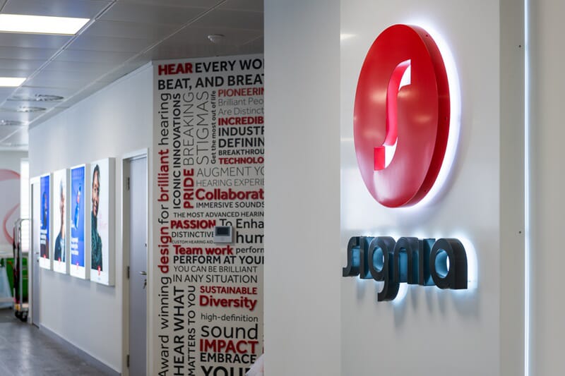
In addition to strategically selecting colours, you can also use colour for your brand through components like custom signage design and graphics. Incorporating your colour scheme effectively in your visuals can help you attract customers, increase the visibility of your message and create a more memorable experience for consumers. Ensuring colour contrast is critical for signage visibility and customer attraction.
Colours are the Emotional Heartbeat of Your Brand
A recent Pantone blog post by Vice President of Pantone Colour Institute™ Laurie Pressman highlighted: “as we move into an increasingly complex cultural landscape, colour remains one of our most intuitive tools for translating the invisible, emotions, intentions, values, into something we can see, feel, and remember.”
To utilise this powerful tool, consider how a variety of colours can elicit a specific emotional response. Here are just a few of the many colours to employ within your space to evoke the ideal customer engagement.
Colours to Impact Consumer Emotions:
Red: The passion, energy or urgency of red can be used everywhere from promotional offers and red roses to warning signs. This colour is a head turner and has also been known to increase adrenaline levels and heart rate. When overused, it can be too much. But when paired with yellow, it can provoke one’s appetite. As a result, it is used in well-known fast food restaurants.
The colour red conveys passion and urgency for your business or brand.
Green: Well-known as a health and wellness colour, it also brings a connotation of money and wealth. The strong tie to nature creates a calming effect in people. Calming colours are now being used to create environments that support neurodiversity. Softer shades and organic neutrals provide lower stimulation than louder colours, which aids environments for students or employees and with fewer triggering experiences overall.
Green signifies wellness and wealth, and it also elicits a calming response in people.
Blue: Known to communicate stability, trust and competence, the colour blue is a popular choice for healthcare providers to organisations for youth. Another benefit is that it has a calming effect within a space, which can create peace in an otherwise chaotic environment.
By using blue in an environment, you not only create a calming feeling for visitors but also convey competence and stability.
Yellow: Large amounts of the bright yellow hue can be jarring since it’s not widely experienced in nature. When balanced with white, it can alternatively offer warmth and happiness. As an attention-grabbing colour, it can also be an effective colour to use for signage when used with enough contrast.

When balanced with the colour white, yellow can provide a sense of happiness and warmth to the eye.
Reasons to Incorporate Colour into Your Brand Strategy
1. Increases Visibility and Attracts Attention
Bold colours that create colour contrast can truly enhance visibility and readability for consumers. To do this, another aspect of colour theory comes into play. Complementary colours, which are polar opposites on the colour wheel, create vibrancy when placed next to each other. This enables the greatest contrast for viewers and for elements to be set apart. A few examples of complementary colours are purple/yellow and red/green.
Analogous colours are neighbours on the colour wheel and create less contrast. An example of these would be yellow, yellow-green and green. While these allow for a cohesive and calm vibe, they can negatively impact the effectiveness of a sign’s message when used next to each other (such as a font on top of a background all in the analogous colour family). Complementary colours not only increase visibility: they can also attract attention and encourage engagement, inspiring customers to do a double-take of your product, kiosk or business. By using contrasting colours, you open the door to readily interest your consumer base.
2. Enhances Retention and Memory
There’s been significant research to prove that colour impacts memory performance through the encoding, retrieval and retaining processes. Vibrant colours specifically have been shown to enhance memory encoding.
Studies that dive into how colours impact memory tasks have highlighted that red influences detail and memory, blue impacts recall for creative memory, green promotes focus, and yellow enhances motivation. So whether you’re educating consumers on your new brand or reinforcing who you are, a consistent set of brand colours can go a long way in setting yourself apart from the competition. This ultimately aids in boosting consumer memory.
3. Create Brand Recognition
Colour has long been a tool of iconic brands. You can leverage a brand palette to create a strong visual identity that reflects your values and becomes recognisable over time. From the beloved blue hue of Tiffany & Co. to Coca-Cola’s unforgettable red, a strong brand with a consistent colour palette is a powerful force.
The Role of Colour in Signage
Recent marketing research details that around 80% of our sensory assimilation is visual, so there’s a powerful role that colour plays in creating effective signage for a business. This reinforces an effective marketing strategy and impacts buying decisions.
High-contrast colour pairings on signage are necessary for long-distance reading and visibility. When contrasting colours are incorporated into a sign’s design, they can also direct consumer eyes to pertinent information highlighted.
According to a study by the University of Southern California, a consumer's response to brand identity and colour usage can affect brand affinity. Therefore, marketers who employ colour psychology successfully can influence buying behaviour as well as brand loyalty.
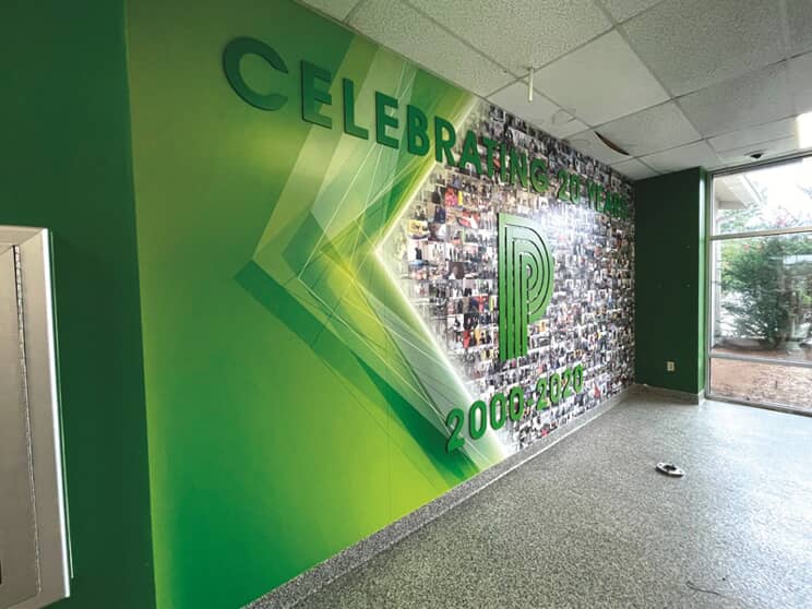
Consistently incorporating your brand’s unique colour palette throughout every piece of signage in your space can elevate recall of your brand. A sign or space that is memorable can impact how your customers perceive your business and feel when they interact with your brand.
Strategically Choose and Use Your Brand Palette
There should be a strategy behind incorporating colour for your brand; it can be more than a decorative choice and ought to be critically considered in all marketing efforts.
Want to harness all that colour can do for your brand’s signage? Our signage experts are ready to help you design visual communication that looks professional, communicates a message and creates a meaningful impact for your brand, ultimately benefiting your bottom line. Contact FASTSIGNS® today!