Things change. Time rumbles on and along with it so do people. Businesses and organisations often need to move with the changes, adapting to the evolving needs of customers, patients and employees, even when they stay in the same physical location. These three brands show how visually rebranding their existing spaces reinforced the goals and direction of their business.
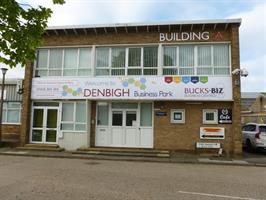
Bucks Biz
.2206171428567.jpg)
.2206171431187.jpg)
Buck Biz owns three business centres, over time the building’s signage had become dated and fragmented as old tenants had moved out of the business offices. The rebrand aimed to unify the three buildings with one brand aesthetic, drive awareness to attract new office space rentals, and assist with wayfinding within the buildings.
Over 12 months, Bucks Biz updated the exterior signage on all buildings, transformed the usability of the venues by removing old businesses information and installing colour coded directories to help with office navigation. To help raise awareness in the wider local area, Bucks Biz used vehicle graphics to help take their new branding to the road.
Following the installation of the new signage, office space lets are consistently increasing.
Bootcamp Pilates
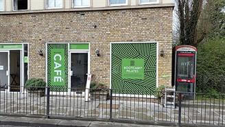
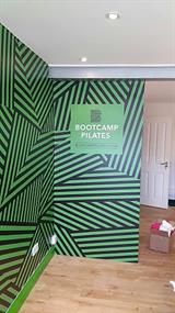
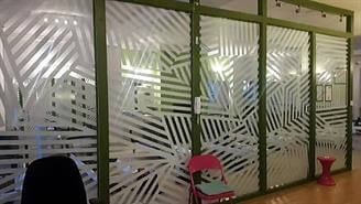
Bootcamp Pilates wanted to position their brand in a more affluent sector of the health and fitness industry. Aware of the connotations of their name, the brand decided to rebrand their facilities to help users understand what their brand was about. Using the brand’s bright colours, one-way vision window graphics, which let in natural light but provide privacy, were used to brand the exterior spaces. Inside wall graphics were placed in the reception area to invigorate and energise patrons. Cut frosted vinyl was applied to interior glass partitions to separate workout areas. Wayfinding signs were incorporated into the interior decor to create a clean and fresh environment.
The updated branding delivered the impact Bootcamp Pilates were looking for, successfully attracting their desired clientele.
Lilian Faithfull
.2206171440303.jpg)
.2206171442000.jpg)
.2206171446055.jpg)
Lilian Faithfull, a care home charity rebranded numerous facilities after changing the name of the brand. Lilian Faithfull’s main aim was to maintain the trust built under the previous brand name, showcase their facilities and services available to their elderly patrons.
At all facilities, post and panel signs were installed to indicate entrances and the facilities from the road, whilst temporary banners were used to promote new services, that the newly branded care homes could offer. Inside, bold canvases, doors and lifts were wrapped in vinyl to depict landscape scenes that would act as sensory reminders for residents, helping them to orientate themselves in the building. Each facility was branded in the same way and vehicles that were used by the charity were also wrapped.
The updated branding provided a unified aesthetic that raised awareness of and promoted Lilian Faithfull’s values and embodied its customer promise across numerous locations.
As your organisation and it’s product and service offerings evolve, so too should your branding. Take a step back and objectively review your visual communications, do they reflect your business as it looks today? The right signs and graphics are a key component of refreshing realigning or rebranding your business.